
Custom Elements in HTML

🧩 Custom Elements in HTML
HTML has evolved from a static markup language to a full-fledged platform for building web applications. One of its most powerful features is the ability to define Custom Elements — your very own HTML tags.
✅ What Are Custom Elements?
Custom Elements are a key feature of the Web Components standard — a set of APIs that lets developers create reusable, encapsulated HTML elements with custom behavior.
For example:
<user-profile name="Alice" age="30"></user-profile>
This <user-profile> tag is not part of standard HTML. It's a custom element you can define with specific behavior and UI.
Each custom element typically includes:
- A JavaScript class that defines its logic and rendering.
- A unique tag name (must include a hyphen).
- Optional lifecycle callbacks for reacting to events like insertion into the DOM or attribute changes.
💡 Why Use Custom Elements?
1. Reusability
Encapsulate UI logic and use your element across multiple pages or projects — just like built-in tags.
2. Encapsulation
By using the Shadow DOM, your element’s internal styles and structure are protected from outside interference.
3. Zero Dependencies
No need for a JavaScript framework — Custom Elements are built into the browser.
4. Modular Architecture
Just like components in frameworks (React, Vue), Custom Elements promote maintainability and separation of concerns.
📅 When Should You Use Custom Elements?
Use custom elements when:
- You need reusable UI pieces that can live independently.
- You’re building framework-agnostic components for multiple teams.
- You want to encapsulate logic and styles tightly.
- You’re building a design system or web component library.
Avoid using them if your project is already heavily coupled to a frontend framework — unless interoperability is a goal.
🛠️ How to Create Custom Elements (Step-by-Step)
Let’s build a simple, interactive custom element: <user-profile>.
🔹 Step 1: Define the Element Class
class UserProfile extends HTMLElement {
  constructor() {
    super();
    this.attachShadow({ mode: 'open' });
    this.render();
  }

  static get observedAttributes() {
    return ['name', 'age'];
  }

  attributeChangedCallback(name, oldValue, newValue) {
    this.render();
  }

  render() {
    const name = this.getAttribute('name') || 'Unknown';
    const age = this.getAttribute('age') || 'N/A';

    this.shadowRoot.innerHTML = `
      <style>
        .profile {
          font-family: sans-serif;
          padding: 1em;
          border: 1px solid #ccc;
          border-radius: 8px;
          background: #f9f9f9;
        }
      </style>
      <div class="profile">
        <h2>${name}</h2>
        <p>Age: ${age}</p>
      </div>
    `;
  }
}
Code Sample #1 : Defining the Element ClassattributeChangedCallback fire at different stages of the element's life (e.g., insertion or attribute change).
🔹 Step 2: Register the Custom Element
customElements.define('user-profile', UserProfile);
Code Sample #2 : Registering the Custom Element🔹 Step 3: Use It in HTML
<user-profile name="Jane Doe" age="28"></user-profile>

<script src="user-profile.js"></script>
Code Sample #3 : Using it in HTML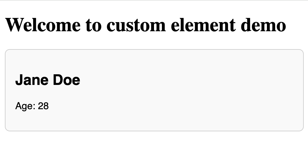
🎯 Bonus: Make It Interactive
Let’s enhance it with a birthday button to increment the age.
render() {
  const name = this.getAttribute('name') || 'Unknown';
  const age = this.getAttribute('age') || 'N/A';

  this.shadowRoot.innerHTML = `
    <style>
      .profile { font-family: sans-serif; }
      button { margin-top: 10px; }
    </style>
    <div class="profile">
      <h2>${name}</h2>
      <p>Age: <span id="age">${age}</span></p>
      <button id="birthdayBtn">Celebrate Birthday 🎂</button>
    </div>
  `;

  this.shadowRoot.querySelector('#birthdayBtn').onclick = () => {
    let newAge = parseInt(this.getAttribute('age') || '0') + 1;
    this.setAttribute('age', newAge.toString());
  };
}
Code Sample #4 : Making It Interactive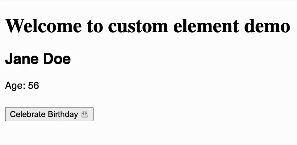
⚠️ Gotchas to Keep in Mind
| Gotcha | Why It Matters | What You Should Do |
|---|---|---|
| Tag name must include a hyphen | Avoids conflicts with native HTML tags | Always use names like my-button, user-profile |
| Shadow DOM may block external CSS | Styles in global CSS files won’t reach inside | Define styles inside the shadow DOM or use CSS variables |
| Not supported in older browsers (e.g., IE11) | Your users might see broken UI | Use polyfills or feature detection if backward compatibility is required |
| No data binding or templating out of the box | You may miss convenience features from frameworks | Consider adding a light templating engine or integrate with frameworks carefully |
| Observed attributes must be explicitly listed | Your component won't react to attribute changes otherwise | Always declare observedAttributes properly to enable dynamic updates |
📦 Packaging Tips
- Bundle your custom elements using Vite, Rollup, or Webpack for modular usage.
- You can publish them to npm or host via CDN for global use.
- Prefix your components (
my-,app-, etc.) to avoid name collisions.
📚 Summary
| Concept | Description |
|---|---|
| What | Custom HTML tags with built-in behavior |
| Why | Reusable, encapsulated, framework-free components |
| When | For UI modules that are reused or shared |
| How | Define a class, use customElements.define, and drop in your HTML |
🚀 Final Thoughts
Custom Elements are a native way to bring component-based architecture to your frontend without the weight of a framework. They offer reusability, encapsulation, and portability across projects.
They’re a perfect fit when building reusable UI pieces, design systems, or standalone widgets. Try one today — you’ll appreciate how clean and maintainable your frontend can be.